Case Study
Research | Mobile UX/UI Design
Background
Within a fast-paced world, it can be difficult to keep up with new books, find something great to read, as well as even find the time to read an actual novel in the first place. Reviewing books or reading book reviews from other people can help motivate people to get back into the habit of reading, and even reflect on how much they’ve read the past year. For bibliophiles, being able to review books and share thoughts with others on them can serve as a meaningful addition to their hobby, and even helps them think about why a book resonated with them (or why it didn’t!).
Role
End-to-end mobile UX/UI designer. Had feedback from an experienced design mentor.
Evaluate how users review books on a mobile app
Identify pain points or frustrations that might occur on media review apps
Deliver a high-fidelity prototype of a mobile book review app, with a focus on the task flow of reviewing a novel
Objectives
Timeline
80 hours over 4 weeks
Research
The main goals of my research were to identify what makes users want to read books more, identify features users would want or expect from a book review app, and discover what current review apps lack.
My main methodologies that I used in my research for this involved competitive analysis, secondary research, and user interviews.
Currently, there is not a large amount of book review apps on the market, but the main one I believed most users have experience with is GoodReads, which is the main focus of my competitive analysis. For additional points of comparison, I looked into other popular media review apps such as LetterBoxd for films in order to see where both apps have successes and weaknesses.
Some key findings from this involved focusing on Goodreads’ cluttered UI and seemingly random recommendations. Additionally, I formed two provisional personas based on the idea or theory that most people who use a book review app would be either frequent readers or casual readers.
Competitive Analysis
Secondary Research
Goodreads, founded in 2006 is an American social cataloging website and a subsidiary of Amazon that allows individuals to search its database of books, annotations, quotes, and reviews. Users can sign up and register books to generate library catalogs and reading lists. As of July 2019, the site has 90 million members.
Common criticism towards the app and site is directed at its outdated UI, frequent crashes, and “random recommendations”. An unusual feature of the site is that they allow users and authors to post quotes attributed to an author without verification.
In looking at the design of the site, one can see it is quite cluttered in all three columns with no seemingly main focus on the Homepage. Additionally, the text is small, with not a great sense of visual hierarchy. There are some superfluous or outdated elements and features, such as quizzes, quotes, and creative writing, while the site seems to be missing elements such as half star ratings, better tagging, or the ability to sort through user-curated lists.
Goodreads, as an app, is rated quite highly on the Apple store at 4.8/5. Despite this, some top reviews still have some critical comments, mostly pointing out the lack of good recommendations, the lack of a proper tagging system, the lack of half stars in reviews, and the need for private ratings or profiles. One user even points out that Letterboxd, a film review site, takes Goodreads concept but makes it better.
For my user interviews, I recruited a mix of four different participants for user interviews, in the age range of 20s-30s, all living in the United States. I used a semi-scripted interview method, involving questions to get a feel of reading habits, why most people might want to use a book review app, and possible points of frustration with existing review apps.
User Interviews
Key Findings - Goals and Needs
All participants expressed a desire to read more, whether they were frequent or casual readers
Some participants like to read to find greater information from books for their own lives, and take notes and highlights to do so
Some users expressed a desire for better recommendations, though every user found their recs from different sources, such as friends or search engines or acclaimed lists.
Key Findings - Frustrations
An issue with reading more is being able to find time
Users also expressed frustration with not being able to find relevant recommendations on search engines or apps, as they can often be random or very general
While Goodreads is beneficial in some ways, it can be “clunky” and doesn’t have the best system for finding new books or for being able to browse through other user reviews
Key Findings - Motivations
Many users are motivated to read more in order to better their own knowledge or to cut down on screen time.
A main motivation behind using a book review app would be the social process. This might be from seeing others’ reviews, seeing friends’ reviews, or connecting with others who have similar interests.
Being able to keep track of reading habits might be motivating as well in order to read more
Define
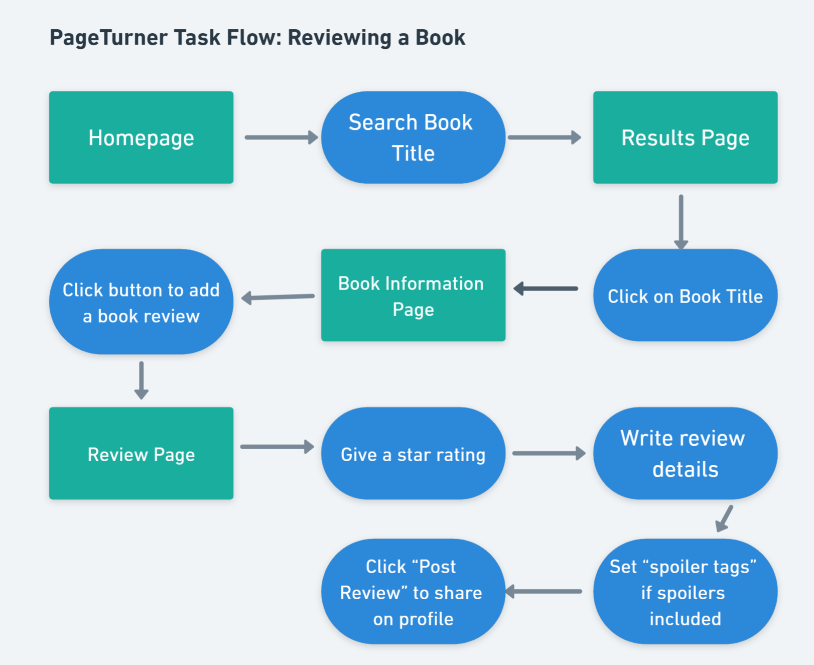
For the PageTurner app mockup, I wanted to take a linear approach in creating my segments while still altering plans based on feedback from my mentor. I started out by defining some personas before creating a main persona to guide me. Another important step was creating my task flow to put me in the mindset of how a user might navigate through a review. I was partially guided by examining Goodreads as well as other media review apps. Mainly, I knew I wanted to take this in a direction of being more simple and minimalist for the user.
Based on my research and user interviews, I formed provisional personas based on the “voracious reader” and the “casual reader”. While both might use a book review app, both will have different purposes in mind. The voracious reader may use it to find new books and comment on insightful reviews, while the casual reader might use it as motivation to read more. My user persona focuses on a mix of these, highlighting a persona that might be very into literature, but whose hobby has fallen by the wayside in a busy world.
User Persona
Given that PageTurner is a book review app, I wanted to make that the main focus and ensure that the flow for this task was simplified. To work through this, I analyzed other flows from existing media review apps to see all variations and options a user could go through to review a novel/movie/song before arriving at my final task flow.
Task Flow
Design
For the design process, I started off with low-fidelity sketches for some crucial or main elements in my task flow, such as the homepage, book page, and the review pop-up window. Getting through the design process was largely simple and based off some user feedback on the need for a more minimalist app. When working with more advanced wireframes, I also wanted to add designs for pages that wouldn’t necessarily be in the final testing phase, just to make it feel like a more complete app and to see what features a user might expect.
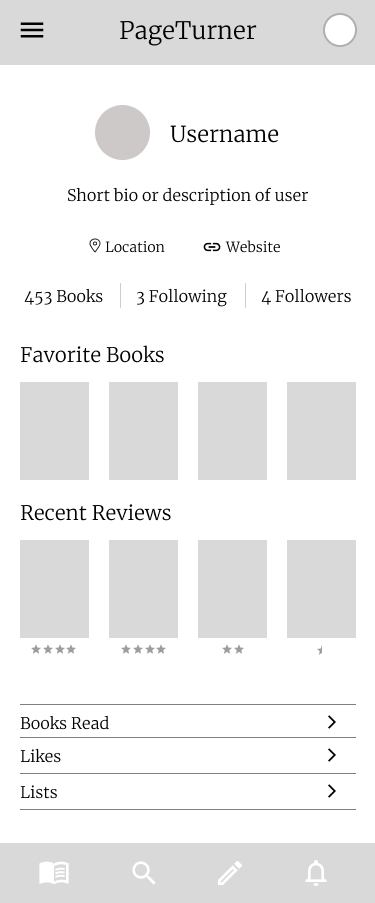
Initial sketches made on Procreate showcasing the homepage and navigation bar, a profile page, and a book’s specific page.
I largely wanted to make everything streamlined and simple to use on a mobile phone, hence adding features for horizontal scrolling and easy ways to get through the review process. Based on feedback, I was able to make certain aspects less cluttered by reducing icons in the navigation bar.
Initial Low-Fidelity Sketches
Homepage
Profile Page
Book Page
This is a quick sketch for the review pop-up screen. I felt the review portion didn’t need to be its own separate “page” but could be a quick write-up for the user to add to or edit as they wished. In addition to a rating and write-up, I felt it might be useful to add a spoiler tag so users did not feel restricted in what they talked about. Additionally, I added a “Read Before” button for more frequent readers to indicate that they’re rereading a book, in case they wanted to indicate a new perspective.
For my mid-fidelity wireframes, I was mostly able to recreate them with some minimal changes to bring it to a less “busy” design. I wanted to focus on what is mostly necessary before adding features that might or might not be necessary. I’ve showcased just a few below.
Mid-Fidelity Wireframes
Homepage
Book Page
Review Screen
Profile Page
Branding
Branding was not a main focus for my PageTurner project, but I knew I wanted something to set apart my app mockup from current book review apps.
I’ve included my completed UI Kit for this project. To combat the idea of a “cluttered” UI, I took a more minimalist approach, combining a traditional font such as Merriweather with the more modern Roboto. For a calming vibe, I went for a cooler color scheme, with the main splashes of color coming from a deep forest green.
Prototype and Testing
With my mid-fidelity wireframes, refining the UI for the prototype was simple, but where I wanted to put in effort was in making some of my animations more complex to make the task flow come to life.
High Fidelity Wireframes
I’ve included a video which showcases the prototype for the main task flow of reviewing a book, involving a user navigating from the homepage to the search bar, searching up a book, landing on the book’s page, and then typing up a review and rating. I’ve also included a link to the original prototype on Figma as well as some separate screens.
Homepage
Book Page
Review Screen
For the testing phase, I recruited four users from the age range of 20s-30s, all located in the USA. The main objectives behind my testing were to see if users would be able to navigate the process of adding a book review, identify useful features, and identify any pain points or design flaws in this process.
Overall, most users found the process of navigating through the actual task flow simple, so this was considered a success
A main aspect that users were confused by was the “Read Before” button. Some users felt it looked like a “refresh” button and some felt that it was unnecessary to indicate that a book is being read again
Some users were confused by the navigation bar icons, and felt that they could be made more accessible with labels or active icons could pop out more
Gradients on the search page feel out of place
Key Takeaways
Conclusion and Next Steps
Going through user testing for my prototype was insightful as it allowed me to see where the strengths and weaknesses of my design were. Overall, I was mostly pleased with the task flow, though if I had had more time, I likely would have tried to test additional features. Most users pointed out flaws with similar parts of the design, which allowed my alterations to be relatively simple. Main changes made include adding more specific lists for the user to discover different books, altering the gradients to be book covers, altering the navigation bar, and excluding the “Read Before” button entirely, since users did not seem to think it served a useful function. I’ve highlighted before and after screens below.
For the search page, I received feedback that the gradients feel slightly removed from the overall design of the app. I decided to instead choose books that serve as representative examples, as I also felt that the gradients came off as a bit clashing with the other colors. The book background serves to add uniformity and gives readers an idea of what each genre is about.
Search Page
Before
After
I made the Navigation Bar slightly more accessible by adding text and better differentiation of the “active” page with a white bar.
Navigation Bar
Before
After
Most of what I changed here involved getting rid of the Read Before button as users didn’t seem to understand it’s intent and it was not a priority. I moved the “Post” button to its place instead.
Review Screen
After
Before
After
Going Forward
Conduct more usability testing
Design other features that might be expected from a book review app
Test other possible task flows


